Immigrant travel Map
Interactive.
Engaging.
Informative.
Engaging.
Informative.
|
|
Alternate Formats
| ||||
Additional Information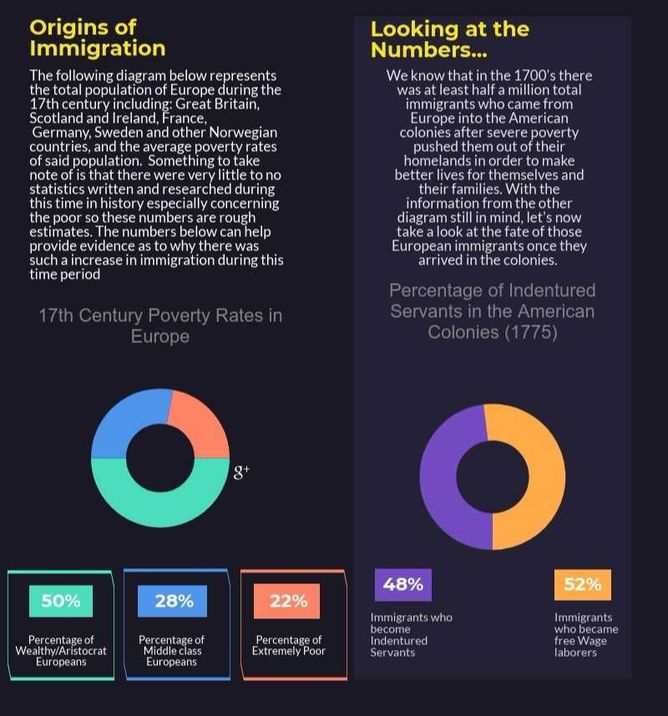
|
Our team's infographic describes the origins of immigration, and specifically observing the economic climate of specific countries in Europe not described in the interactive map. Here, we take a look at France, Sweden, and other Norwegian countries.
Our graph to the right illustrates the percentage of extremely poor immigrants who became indentured servants in the American colonies during 1775. As indicated, a little less than half of immigrants became indentured servants. It makes us wonder. Was it worth it? Is the payoff of selling one's freedom for x amount of years beneficial? | ||
|
|
|